


 See Also
 Important: Important: |
|---|
| This is retired content. This content is outdated and is no longer being maintained. It is provided as a courtesy for individuals who are still using these technologies. This content may contain URLs that were valid when originally published, but now link to sites or pages that no longer exist. |
Richard Grimes,
June 2009
 Summary
Microsoft® Internet Explorer® 6 for Windows® phones provides functionality until now only found on desktop computers running Windows. Internet Explorer Mobile provides scripting, and multimedia controls and Microsoft DirectX® transforms enable developers to create a rich user experience.
Applies To
Windows Mobile 6.5
Microsoft Internet Explorer 6
Developing for Internet Explorer 6
Detecting Internet Explorer Mobile 6
Using Internet Explorer Mobile 6 Objects
Using Filters and Transitions in Internet Explorer Mobile 6
Displaying Web Pages on Internet Explorer Mobile 6
Best Practices for Developing Web Sites for Internet Explorer Mobile 6
Introduction
Internet Explorer Mobile 6 provides many features that Web developers can use to provide a rich user experience on a mobile device. However the form factor of mobile devices and the way that devices access the network mean that developers should make special considerations for Windows phone Web applications. Internet Explorer Mobile 6 provides all the facilities for developers to customize code for mobile devices.
Developing for Internet
Explorer 6
Because Windows phones come in different form factors, there are different mechanisms to provide input. These input mechanisms differ from the mechanisms for input into Internet Explorer on the developer workstation, and developers targeting mobile devices should be aware of these differences. Some phones, such as Windows Mobile® Professional devices, have a touch-sensitive screen, so Web page navigation is through touches on the screen and through gestures. The user scrolls a Web page by dragging a finger across the page, and follows hyperlinks by touching them. Other phones, such as Windows Mobile Standard devices, do not have a touch-sensitive screen, and instead have a directional pad (D-pad). The user scrolls a Web page by pressing the d-pad arrow keys and follows a hyperlink by pressing the center key, also called SELECT key.
Internet Explorer Mobile on a Windows phone supports Wireless Markup Language (WML). WML is a standard XML-based markup similar to HTML, but designed specifically for mobile devices. WML decks provide access to device features such as phone and mail capabilities.
The following code example shows how they are stored and accessed from a Web server similarly to HTML Web pages.
 Copy Code Copy Code
|
|
|---|---|
<wml> <card id="base" title="Pizza Search"> <p><strong>Pizza Search Results</strong></p> <p>There are 2 pizza suppliers near you:</p> <p><a href="#karl">Karl's Pizzas</a></p> <p><a href="#juan">Juan's Pizzas</a></p> </card> <card id="karl" title="Karl's Pizzas"> <p><strong>Karl's Pizzas</strong></p> <p>1 Main Street, Maintown.</p> <p>Delivers 6pm to 2am</p> <p><a href="wtai://wp/mc;11231234567">Call Karl's Pizza</a></p> </card> <card id="juan" title="Juan's Pizzas"> <p><strong>Juan's Pizzas</strong></p> <p>100 Side Street, Maintown.</p> <p>Delivers 10pm to 1am</p> <p><a href="wtai://wp/mc;11235556666">Call Juan's Pizza</a></p> </card> </wml> |
|
In this code, there is a deck of three cards. When this WML file
is first loaded by Internet Explorer Mobile 6, the first card,
base, is displayed. This lists the two results from a
Web site for a search of pizza delivery businesses in the area.
Each result has a separate card and the main results link to each
card with an
<a>element. When the user clicks the anchored
text, the linked card is displayed. Each page in the result list
gives information about the specific business and gives a link to
call the telephone number using Wireless Telephony Application
Interface (WTAI). The link indicates that the make call (
mc) function of the public WTAI library (
wp) should be executed with the data given after the
semicolon.
Mobile devices have small screens and use mobile phone networks for network access, and the concise format of WML reduces the number of network accesses.
Internet Explorer 6 also supports rendering HTML 4.01 and the full support of XHTML 1.0 standard. This means that Internet Explorer Mobile 6 can access and render pages from most sites on the Web. The 100 most popular sites on the Web work without any changes.
The following code example shows an HTML Web page equivalent to the earlier WML example.
|
Copy Code
|
|
|---|---|
<html>
<head>
   <script src="code.js"
type="text/javascript"></script>
</head>
<body>
   <div id="base" style="display:block">
	<p><strong>Pizza Search
Results</strong></p>
	<p>There are 2 pizza suppliers near you:</p>
	<p><div onclick="showDiv('karl');"
			style="text-decoration:underline">Karl's
Pizzas</div></p>
	<p><div onclick="showDiv('juan');"
			style="text-decoration:underline">Juan's
Pizzas</div></p>
   </div>

   <div id="karl"  style="display:none">
	<p><strong>Karl's Pizzas</strong></p>
	<p>1 Main Street, Maintown.</p>
	<p>Delivers 6pm to 2am</p>
	<p><a href="tel:11231234567">Call Karl's
Pizza</a></p>
   </div>

   <div id="juan"  style="display:none">
	<p><strong>Juan's Pizzas</strong></p>
	<p>100 Side Street, Maintown.</p>
	<p>Delivers 10pm to 1am</p>
	<p><a href="tel:11235556666">Call Juan's
Pizza</a></p>
   </div>
</body>
</html>
|
|
The data is provided by three
<div>elements, only one of which will be shown
at any time. The first
<div>element gives a list of the results from
the Web application, and when the user clicks on the links, one of
the other
<div>elements is displayed. These elements give
an anchor element to enable the user to call the selected business
by using the
tel:protocol handler, which starts the phone dialer on
the device.
Internet Explorer Mobile 6 supports scripting with JavaScript.
The following code example shows the contents of the
code.jsfile, referenced earlier, used to hide and
display the
<div>elements.
|
Copy Code
|
|
|---|---|
function toggle(id, on){
   var elem = document.getElementById(id);
   elem.style.display = (on ? "block" : "none");
}
function hideAll(){
   toggle("base", false);
   toggle("karl", false);
   toggle("juan", false);
}
function showDiv(item){
   hideAll();
   toggle(item, true);
}
|
|
Detecting Internet Explorer
Mobile 6
Internet Explorer Mobile 6 is based on the desktop version of
Internet Explorer 6 with additional mobile features. This means
that Internet Explorer Mobile 6 can render Web pages intended for
desktop browsers and Web pages intended for mobile devices. The
user chooses whether to view a desktop or mobile version through
the
Viewmenu. If the user chooses to view desktop pages,
Internet Explorer Mobile 6 provides values in the
User-Agentheader of the
GETHTTP request sent to the Web site that are
identical to those that would be sent by a desktop browser.
The following code example shows the values in the
User-Agentheader.
|
Copy Code
|
|
|---|---|
User-Agent: Mozilla/4.0 (compatible; MSIE 6.0; Windows NT 5.1; Windows Phone 6.5) |
|
If the user chooses to view pages customized for mobile devices,
Internet Explorer Mobile 6 provides a
User-AgentHTTP header equivalent to earlier versions
of Internet Explorer on Windows Mobile. The following code example
shows the User-Agent header sent when the user requests mobile
pages.
|
Copy Code
|
|
|---|---|
User-Agent: Mozilla/4.0 (compatible; MSIE 6.0; Windows CE; IEMobile 8.12; MSIEMobile 6.0) |
|
Typically, server-side Web applications check the value in the
User-Agentheader and customize the returned page for
the client browser, and usually return low-bandwidth,
small-dimension pages for mobile devices. By using the desktop
Viewoption, Internet Explorer Mobile 6 can show full
Web pages, and the device user can zoom the page to see the text at
a comfortable size and use the panning facility to move around the
page. This
Viewoption brings to Windows phones the wealth of Web
pages not customized to mobile devices.
In addition, both for requests for mobile and desktop pages, Internet Explorer Mobile 6 provides custom headers that indicate the capabilities of the device. The following table lists the custom headers sent to the Web server.
| Header | Description |
|---|---|
|
|
The color depth of the devices, such as
|
|
|
An identifier for the processor type, such as
|
|
|
The operating system on the devices, such as
|
|
|
The dimensions of the device screen, such as
|
|
|
A Boolean value indicating if the device has a microphone, such
as
|
The server-side Web application may use the values of these headers to customize the response for the device, for example, to provide different graphics files for different color depth values. The following code example shows ASP.NET code that uses one of these user agent headers.
|
Copy Code
|
|
|---|---|
string image = String.Format("image_{0}.jpg",
   Request.Headers["UA-color"]);
|
|
You can then provide a series of images called
image_color4.jpg,
image_color8.jpg,
image_color16.jpg, and so on, for the devices that you
support.
Providing Client-Side Code
Internet Explorer Mobile 6 provides scripting through Microsoft Jscript® 5.8 development software. This means that Web developers can create applications with client-side code to be executed on the device. Client-side scripting with Dynamic HTML (DHTML) enables developers to create rich, innovative applications, and furthermore, by using code to update the user interface, round trips to the server can be avoided. Reducing network calls is a key design feature for mobile devices.
Internet Explorer Mobile 6 also enables developers to use the
XMLHttpRequestobject. This object provides a mechanism
for applications to download data from the network as raw data, or
as data that can be parsed by using the XML DOM. The
XMLHttpRequestobject can be used to download data
synchronously. But because any network access leads to an
unavoidable delay, the best practice is to call the object
asynchronously and provide scripting code that is called to update
the user interface when the data is returned. These
features—scripting, asynchronous downloads, and user interface with
HTML and CSS—form the core of AJAX development. Internet Explorer
Mobile 6 supports AJAX development.
The
XMLHttpRequestobject on Internet Explorer Mobile 6 can
be accessed as a property of the
windowobject so that developers do not have to use
ActiveX code to activate this object. Internet Explorer Mobile 6
security applies the same origin policy, which means that the
XMLHttpRequestobject can access any page and any Web
service on the server, as long as the host name, protocol, and port
are the same as the origin of the page where the code is executed.
The following code example shows how to use the
XMLHttpRequestobject to obtain additional data from
the Web site. This example is located on a page on the same Web
site,
http://www.example.com/default.htm.
|
Copy Code
|
|
|---|---|
<script type="text/javascript">
   function getData()
   {
	var name = document.getElementById("idName").value;
	window.XMLHttpRequest.open(
		 "GET", "http://www.example.com/data?name=" + name);
	window.XMLHttpRequest.send();
	idResult.innerText = window.XMLHttpRequest.responseText;
   }
</script>
|
|
This code makes a call back to a Web service called
datapassing the name given by a control on the Web
page that has the ID
idName. When the
sendmethod is called, a synchronous call is made to
the Web service. This means that the call blocks until the response
is received. When the call returns, the raw data is used to
populate the contents of a control with the ID of
idResult.
Typically, AJAX code makes asynchronous calls by providing a
callback function for the
onreadystatechangeproperty of the
XMLHttpRequestobject. In this situation, the
sendmethod returns immediately when it is called, and
the callback function is called when the asynchronous call is
completed. The results can be harvested from the
XMLHttpRequestobject.
Web applications typically use DHTML to update the user interface according to the user actions and the data obtained asynchronously. This reduces the number of server round trips to update the user interface. However, it still means that some initial calls are made to download the original HTML, CSS, and script files.
AJAX is a mature technology with a vibrant and experienced community of developers. The AJAX features of Internet Explorer Mobile 6 provide an opportunity for a new, talented group of developers to target Windows phones.
Using Internet Explorer Mobile 6
Objects
Internet Explorer Mobile 6 enables users to enjoy Flash content through the Adobe Flash Lite 3.1 control. This is an optional plug-in designed to work with Internet Explorer Mobile 6 to bring Flash applications to Windows phones. Adobe Flash 3.1 supports most Flash 9 code, but there is no support for ActionScript 3.
The following code example shows how to use a Flash application on a Web page, in this case, to view a Flash movie.
|
Copy Code
|
|
|---|---|
<object width="212" height="172"> <param name="movie" value="http://www.youtube.com/v/rIjNJZpRtj8&hl=en&fs=1"> </param> <param name="allowFullScreen" value="true"></param> <param name="allowscriptaccess" value="always"></param> <embed src="http://www.youtube.com/v/rIjNJZpRtj8&hl=en&fs=1" type="application/x-shockwave-flash" allowscriptaccess="always" allowfullscreen="true" width="212" height="172"> </embed> </object> |
|
Internet Explorer Mobile 6 also supports ActiveX® controls
through the
<object>element. However, there is a
restriction: controls must already be installed on the device,
because there is no facility for downloading or updating a control
through the
codebaseattribute. This means that Web pages can embed
the Windows Media Player control. The following code example shows
how to use the Windows Media Player control to play an audio file
on the mobile device.
|
Copy Code
|
|
|---|---|
<object classid="CLSID:6BF52A52-394A-11D3-B153-00C04F79FAA6" type="application/x-oleobject" width="400" height="380"> <param name="url" value="file://\storage card\plugins\niceday.wmv"> <param name="ShowControls" value="1"> <param name="volume" value="100"> </object> |
|
Using Filters and Transitions in
Internet Explorer Mobile 6
Internet Explorer Mobile 6 enables developers to apply image filters and transforms through styles.
DirectX image filters and transforms enable Web developers to
apply creative effects to Web content. For example, in the
following code, the contents of the
<span>element are displayed as red text on a
blue background with a radial gradient applied.
|
Copy Code
|
|
|---|---|
<span style="filter: progid:DXImageTransform.Microsoft.Alpha( style=2, opacity=25, finishOpacity=100, startX=0, finishX=100, startY=100, finishY=0); width: 200px; color: darkred; background-color: skyblue" <div> This text will appear as dark red text on a sky blue background with a radial gradient centered on the center of the SPAN. </div> </span> |
|
Image filters and transforms can be scripted, which means that animations can be created that are simple, but visually impressive.
Internet Explorer Mobile 6 provides alpha channel support in
Portable Network Graphics (PNG) files. There is no native
<img>element support for the alpha channel in
.png files so that an image transform can be used instead. The
following code example shows how to display a .png file that uses
an alpha channel.
|
Copy Code
|
|
|---|---|
<img src="blank.gif" style="width: 163px; height: 77px; filter: progid:DXImageTransform.Microsoft.AlphaImageLoader( src='moon.png', sizingMethod='scale')" /> |
|
Displaying Web Pages on Internet
Explorer Mobile 6
As mentioned earlier, the user can choose to view Web pages
designed for desktop computers or pages designed for mobile
devices, and this request is sent to the server through the
User-Agentheader, together with details about the
device screen capabilities through the
UA-colorand
UA-pixelsheaders. The server may use this information
to customize the Web page for the device.
By default, the dimensions of a Web page are 1024 x 768. This
reflects the accepted view of the minimum screen size to view Web
content: SVGA. The following code example shows how to access the
size of the screen. When it is run on Internet Explorer Mobile 6,
this code returns the
width1024 and
height768.
|
Copy Code
|
|
|---|---|
width = document.documentElement.clientWidth; height = document.documentElement.clientHeight; |
|
This width and height affects graphics and text positioned by
using DHTML or positioning elements like
<center>. The following code example shows the
HTML code to draw the word
centeredin the center of a page of the width 1024
pixels.
|
Copy Code
|
|
|---|---|
<center>centered</center> |
|
If the device has a screen with a width of 240 pixels, this word appears beyond the right edge of the screen. The mobile device user can pan the screen with a gesture of "dragging" the screen to the left or right. The following screen shot shows panning in action.

The shaded transparent rectangle in the lower right gives the dimensions of the page, and the white rectangle shows the current view of that page; in this case the user is viewing the center part of the page. Panning and the ability of Internet Explorer Mobile 6 to zoom the page enable users to view Web pages intended for desktop computers on a screen that is a fraction of the size of a desktop computer.
If the page does not use positioning elements on text, Internet
Explorer Mobile 6 automatically wraps text to the screen width,
regardless of the width of the page. The following illustration
shows a long line of text that is the only content of the
<body>element.
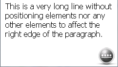
In this example, the page width could be many times the width of the screen, but automatic text wrapping has rendered the text so that the user does not need to use panning.
Internet Explorer Mobile 6 provides support for two
<meta>tags that relay information to the device
about the suitability of the page for mobile devices. The following
code example shows how to use the
mobileoptimizedtag.
|
Copy Code
|
|
|---|---|
<meta name="mobileoptimized" content="0" /> |
|
When Internet Explorer Mobile 6 displays a page that has this
tag, it makes the page width equal to the value given in the
contentattribute; a value of
0means that the page width is the same as the size of
the screen. This means that positioning elements are relative to
the screen width, so that the page earlier, with the
<center>element, displays the text in the center
of the screen and panning is not enabled, because the width of the
page will be shown. If the value of
contentis larger than the width of the screen, panning
is enabled and positioning elements use this width.
The following code example shows how to use the
viewporttag.
|
Copy Code
|
|
|---|---|
<meta name="viewport" content="width=2000, height=3000"> |
|
Here, the
contentattribute enables you to define both the width
and the height of the page. Again, Internet Explorer Mobile 6
applies automatic text wrapping to the actual screen width for text
that does not have positioning elements, and text wrapping may mean
that the displayed page height is actually larger than the value
given in the
<meta>tag.
Best Practices for Developing Web
Sites for Internet Explorer Mobile 6
Windows phones have restrictions that should be addressed in correctly designed Web applications. The three principle restrictions are the screen size, the fairly slow processing power of the device, and the fact that network access is through a phone connection, which incurs call charges to the user.
Developers should follow best Web programming practices, that
is, the application should be separated into files for code and for
markup. The code should be provided in JavaScript files, and the
markup should be provided in HTML files and CSS files. Care should
be taken to make sure that these files only contain script and
style codes that will be used. Therefore, it is much better for the
server-side code to use the user agent headers in the HTTP
GETrequest to receive information about the browser
capabilities and only provide code that runs on the device, instead
of detecting the device capabilities in the script by using the
navigatorobject.
Applications should not make assumptions about the rendered
screen size and should not assume that the browser resizes media
like images and video. The user agent headers in the HTTP
GETrequest provides information about the screen size
and color depth so that an application should make good use of
these values to customize the code returned to the device.
Additionally, the Web application should choose bit rates for
streamed media that are appropriate for the network being used,
because this helps reduce stalls and improves the user's
experience.
Internet Explorer 6 supports scripting and a wealth of objects that can be scripted. Therefore, developers should prefer writing code that updates the user interface with DHTML instead of round trips to the server. However, ActiveX object downloads are not supported through the browser. Therefore, script should only use objects that are guaranteed to exist on the device. Windows Mobile 6.5 provides a separate installation mechanism for ActiveX controls. But the installation requires docking with a desktop computer.
Internet Explorer 6 security maintains a same-source policy for
scripting code, so that the
XMLHttpRequestobject may only obtain data from the
same site as the page.
The following table summarizes best practices for development of Internet Explorer 6 applications.
| Principle | Guidance |
|---|---|
|
Detect Internet Explorer Mobile 6 |
If, on the Viewmenu, the Desktopoption is enabled, Internet Explorer Mobile 6 sends:
If, on the Viewmenu, the Mobileoption is enabled, Internet Explorer Mobile 6 sends:
|
|
Fit to content screen width |
Use one of the following code lines:
|
|
Script processing is expensive |
|
|
Customize media to mobile |
|
Conclusion
Internet Explorer 6 for Windows Mobile 6.5 provides features that were previously found only on desktop computers. These new features provide support for scripting, support for Flash and ActiveX objects, and support for asynchronous downloads and DirectX transforms and filters. All these features bring rich AJAX development to the Windows phone platform.
Author Bio
Richard Grimes works with Content Master, part of CM Group Ltd. He writes and teaches Windows and Internet development with .NET and with C++. He is the author of the Microsoft Press® book Programming With Managed Extensions For Microsoft Visual C++ .NET. Content Master is a Microsoft Premier Vendor and Gold Certified Partner specializing in developing technical content.